Platform
Website
Timeline
5 weeks
My role
UI Designer
Tools used
Sketch/HTML/CSS
Design Brief
I began with a heuristic analysis, competitive audit, & identifying target audiences.
Workflows
I created user workflow/flowcharts to visualize user steps needed in order to complete a task or achieve a goal.
Usability testing
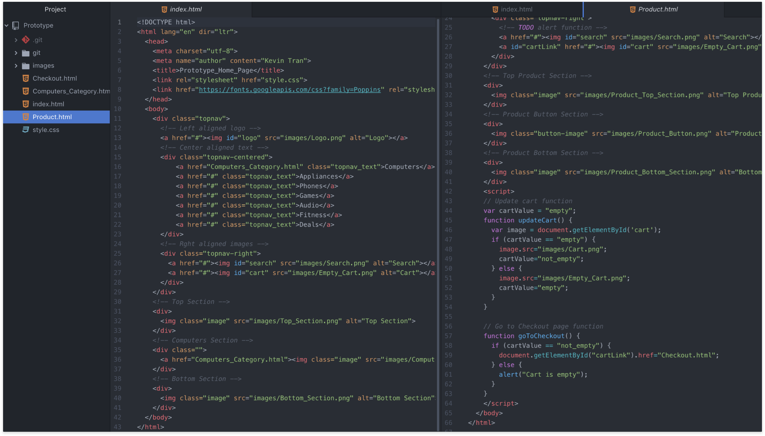
I created a simple prototype in HTML & CSS and hosted on Github pages. This allowed for fast user testing and feedback.
Low fidelity wireframes
From the user testing feedback, I created low-fidelity wireframes to establish more cohesive structure and added visual elements.
Design comps
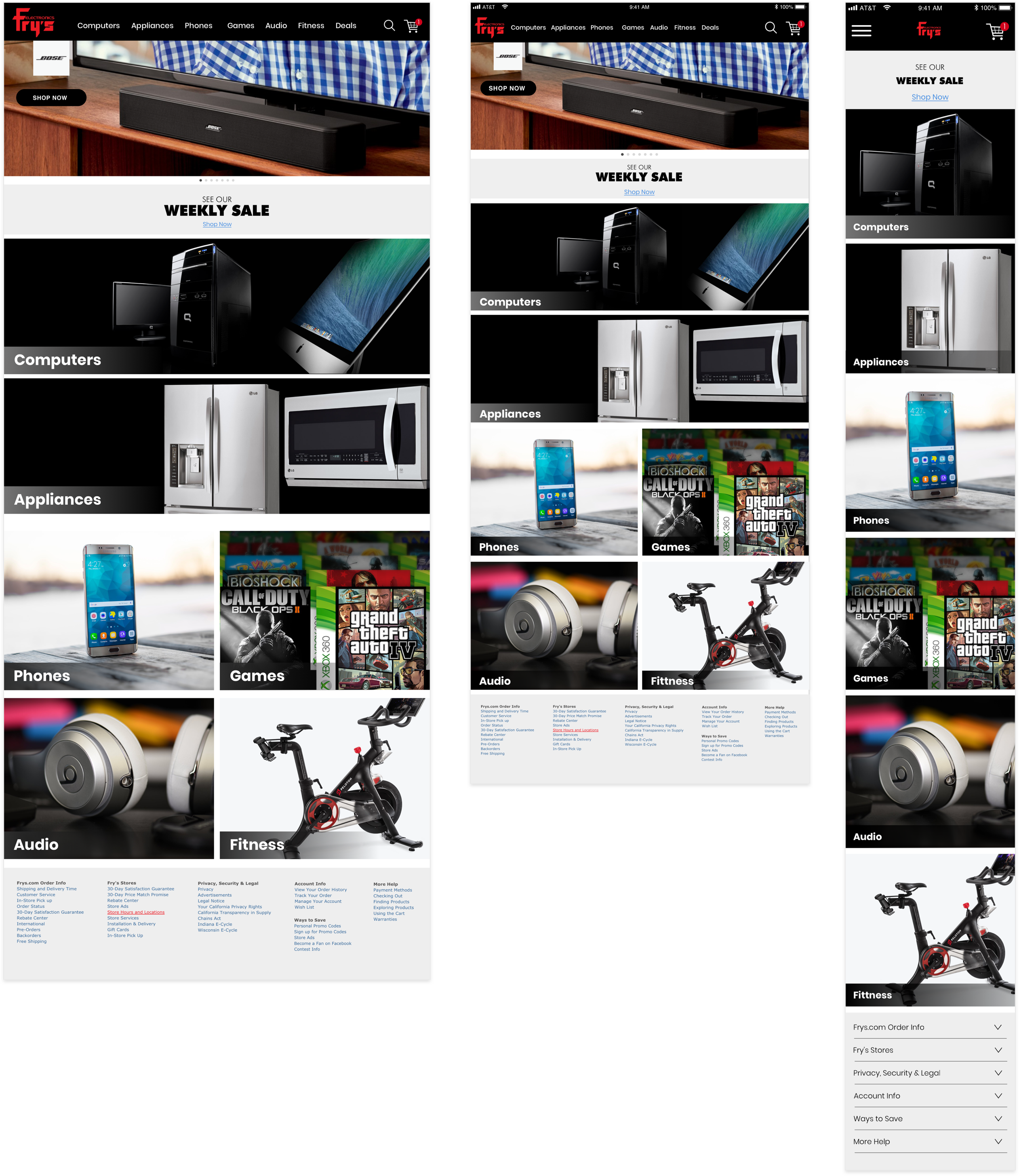
- Home page
- 1024px
- 768px
- 480px
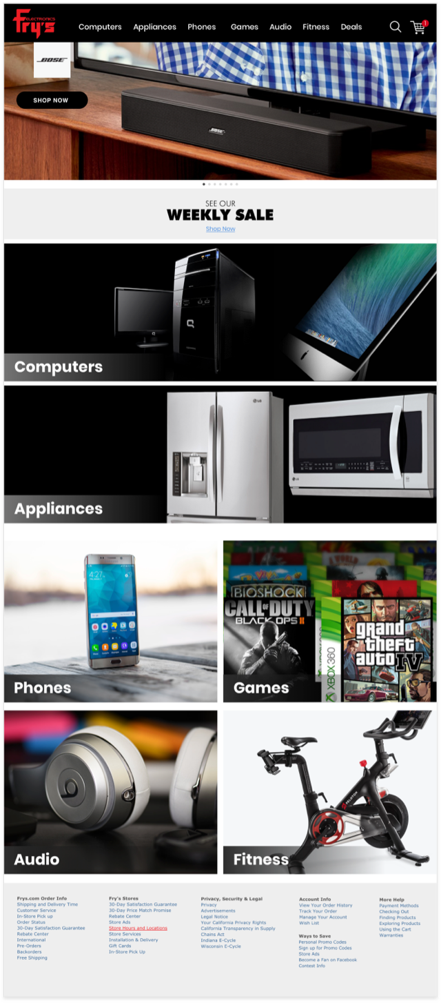
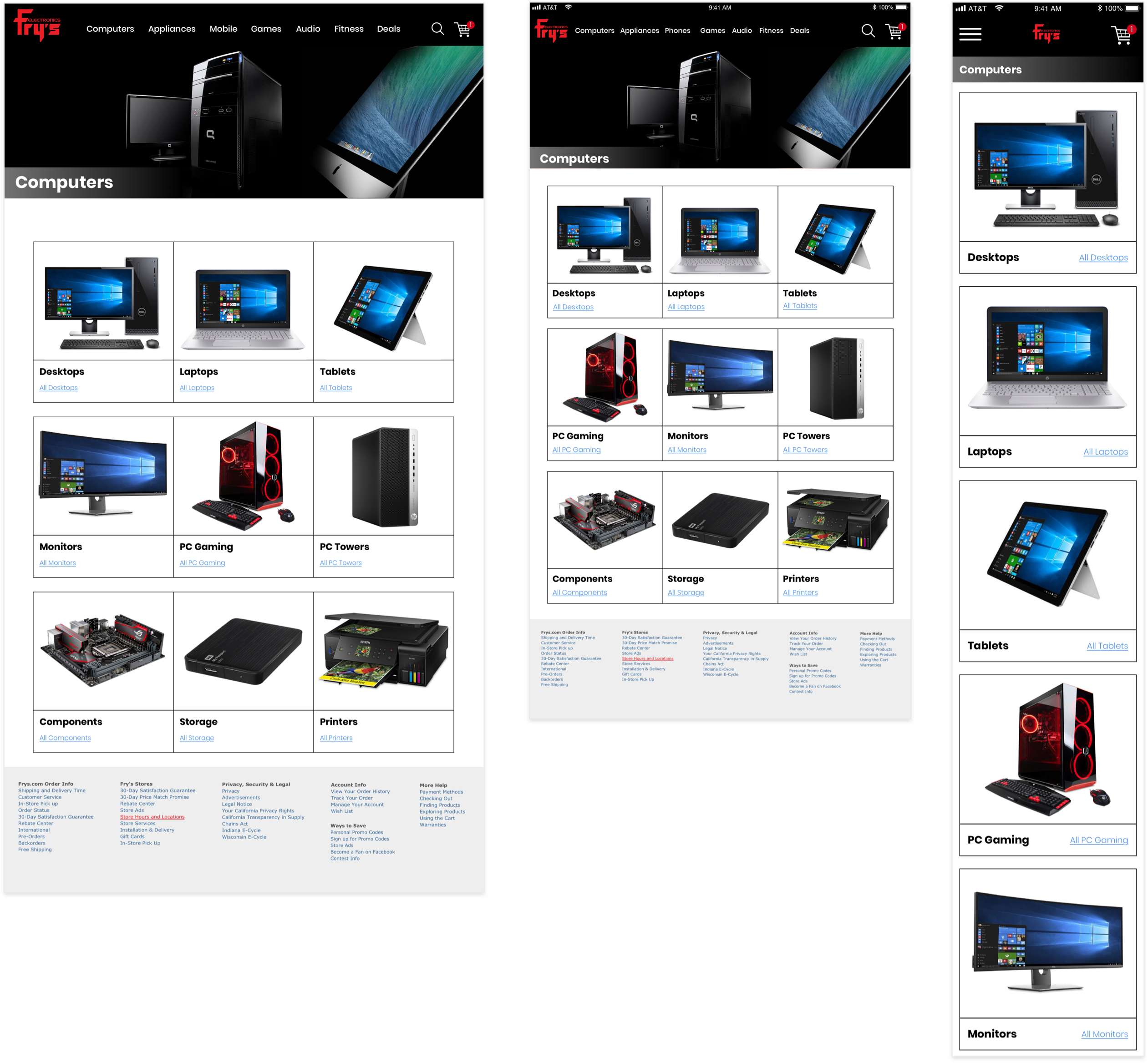
- Projects page
- 1024px
- 768px
- 480px
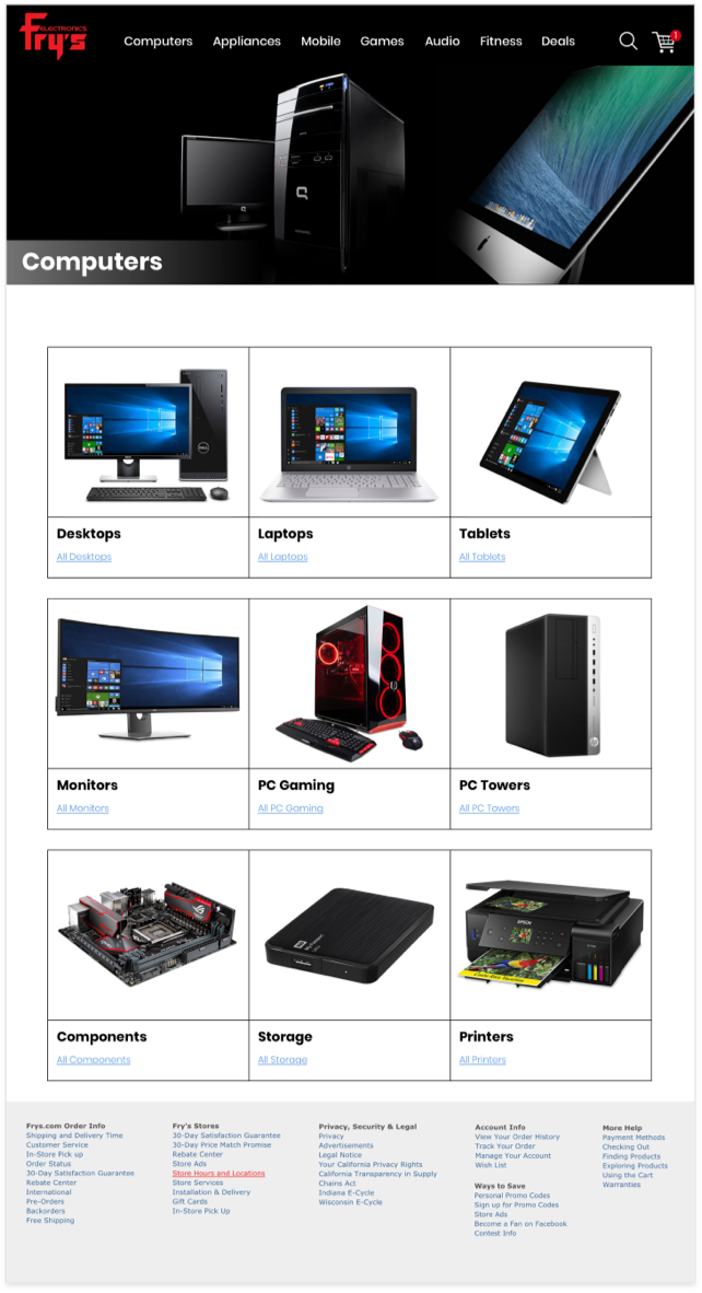
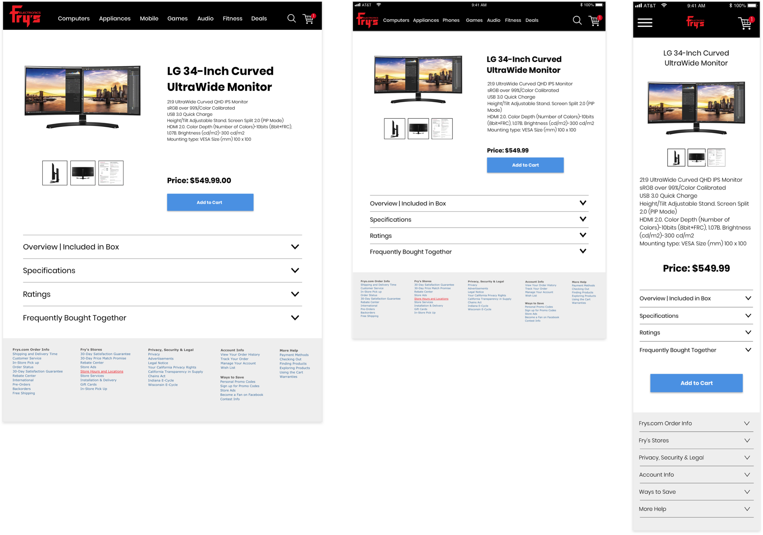
- Product details page
- 1024px
- 768px
- 480px
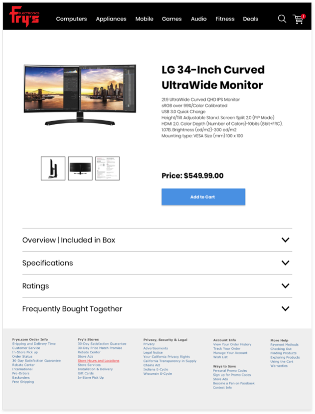
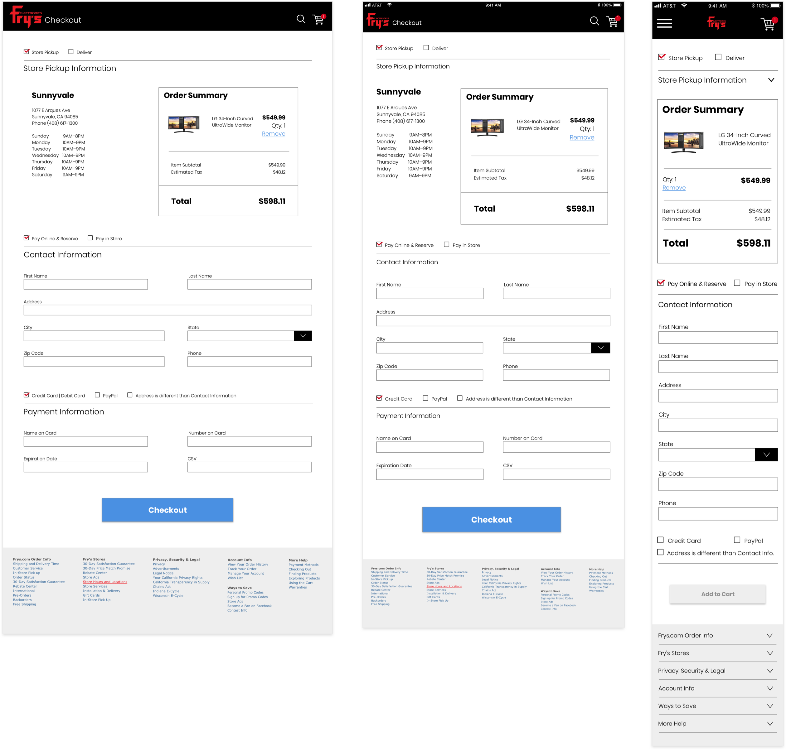
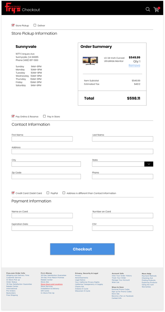
- Checkout page
- 1024px
- 768px
- 480px
Behind the scenes
- Screen shot of prototype code - HTML & CSS

Common Questions about project
I started with a heuristic analysis and created user journey workflows. Then created wireframes, UI designs and developed a working prototype for user testing.
I designed all responsive screens of the user journey in Sketch and developed the prototype in HTML, CSS and hosted on Github.
To fit all product information and website features into user-friendly mobile experiences.

